Button
Button text
- Button text should be clear, unambiguous, and brief. Except for certain cases where the object is obvious and a verb alone can suffice, a good formula for clear button text is “
verb+noun.” - Use sentence case for button text. Only capitalize the first word (with the exception of proper nouns).
Variants
As a general rule, pages should have a single primary button for the highest-priority action. This button should be accompanied by secondary or tertiary buttons for the lower-priority actions.
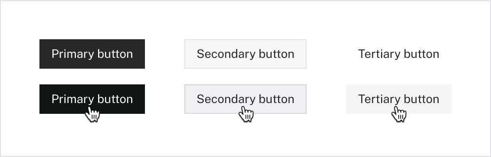
| Primary | For the single most important user action on a page or part of the interface. There should never be multiple primary buttons competing for the user’s attention. |
|---|---|
| Secondary | For secondary actions. Most actions on a page should use this variant. Often used in conjunction with primary buttons. |
| Tertiary | For lowest-priority actions. (These are also called “ghost buttons,” since they have no fill color or border.) |
Buttons with icons
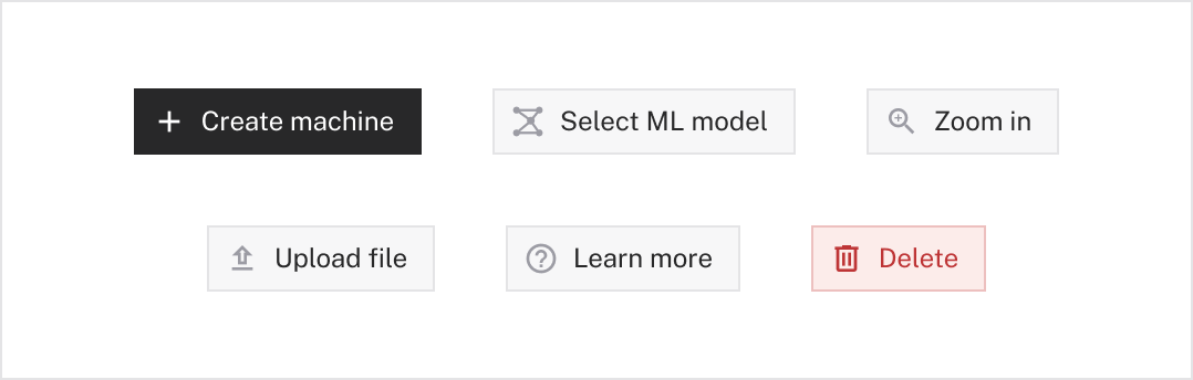
Icons can be used to clarify button text and help the user quickly skim a page. Icons should always be white in primary buttons and gray-6 in secondary and tertiary buttons.
For buttons that only contain an icon, see the IconButton element.

Button groups
Groups of buttons should be arranged horizontally and have a gap of 8px .
Destructive buttons
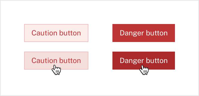
For actions that can affect a user’s data, use destructive button variants. Like regular buttons, destructive buttons have variants that indicate the importance of the action.
| Caution | For destructive (but not critical) actions that could affect a user’s data. |
|---|---|
| Danger | For critical destructive actions. Use sparingly. Always clearly specify the object that will be affected (ex: say “Delete organization,” not “Delete”). |
Disabled states
As a rule of thumb, we try to avoid using disabled buttons because they have poor accessibility and can create a frustrating user experience.
When unavoidable, disabled buttons should always include some indication of why the action is blocked, like helper text under the button or an explanatory tooltip on hover.