Select
A simple user input for selecting from a list of options. This is an implementation of the native HTML <select /> with our styles applied.
Basic
import { Select } from '@viamrobotics/prime-core';<Select cx="max-w-[200px]"> <option>Option 1</option> <option>Option 2</option> <option>Option 3</option> <optgroup label="More options"> <option>Option 4</option> <option>Option 5</option> <option>Option 6</option> </optgroup></Select>Searchable
import { Label, SearchableSelect } from '@viamrobotics/prime-core';<Label> Searchable select <SearchableSelect client:load slot="input" placeholder="Search options" options={[ 'First option', 'Second option', 'Third option', 'Something else', 'With a whole lot of parts' ]} exclusive /></Label>Searchable with arbitrary text
import { Label, SearchableSelect } from '@viamrobotics/prime-core';<Label> Searchable select with create <SearchableSelect slot="input" placeholder="Type to find or create..." otherOptionPrefix="Other:" options={['Hello', 'From', 'The other side']} sort={SortOptions.REDUCE} /></Label>Searchable with icons
import { Label, SearchableSelect } from '@viamrobotics/prime-core';<Label> Select an OS/Platform <SearchableSelect slot="input" exclusive placeholder="Type to find or create..." options={[ { value: 'linux-aarch64', label: 'Linux (Aarch64)', icon: 'linux' }, { value: 'linux-x86', label: 'Linux (x86_64)', icon: 'linux' }, { value: 'linux-arm7l', label: 'Linux (Arm7l)', icon: 'linux' }, { value: 'macos', label: 'Mac', icon: 'apple' }, { value: 'windows', label: 'Windows', icon: 'windows' } ]} /></Label>Searchable with descriptions
import { Label, SearchableSelect } from '@viamrobotics/prime-core';<Label> Select a MlModel <SearchableSelect slot="input" exclusive placeholder="Type to find or create..." options={[ { value: 'uuid-1', label: 'viam:catdetector', description: 'tflite' }, { value: 'uuid-2', label: 'nasa:asteroid-classifer', description: 'pytorch' }, { value: 'uuid-3', label: 'viam:plate-reader', description: 'tflite' }, { value: 'uuid-4', label: 'apple:face-detection', description: 'metal' }, { value: 'uuid-5', label: 'mug-detector', description: 'tflite' } ]} /></Label>Searchable with multiple
import { Label, SearchableSelect } from '@viamrobotics/prime-core';<Label> Select multiple options <SearchableSelect slot="input" options={[ 'First option', 'Second option', 'Third option', 'Something else', 'With a whole lot of parts' ]} sort={SortOptions.REDUCE} exclusive multiple /></Label>Quick-add suggestions
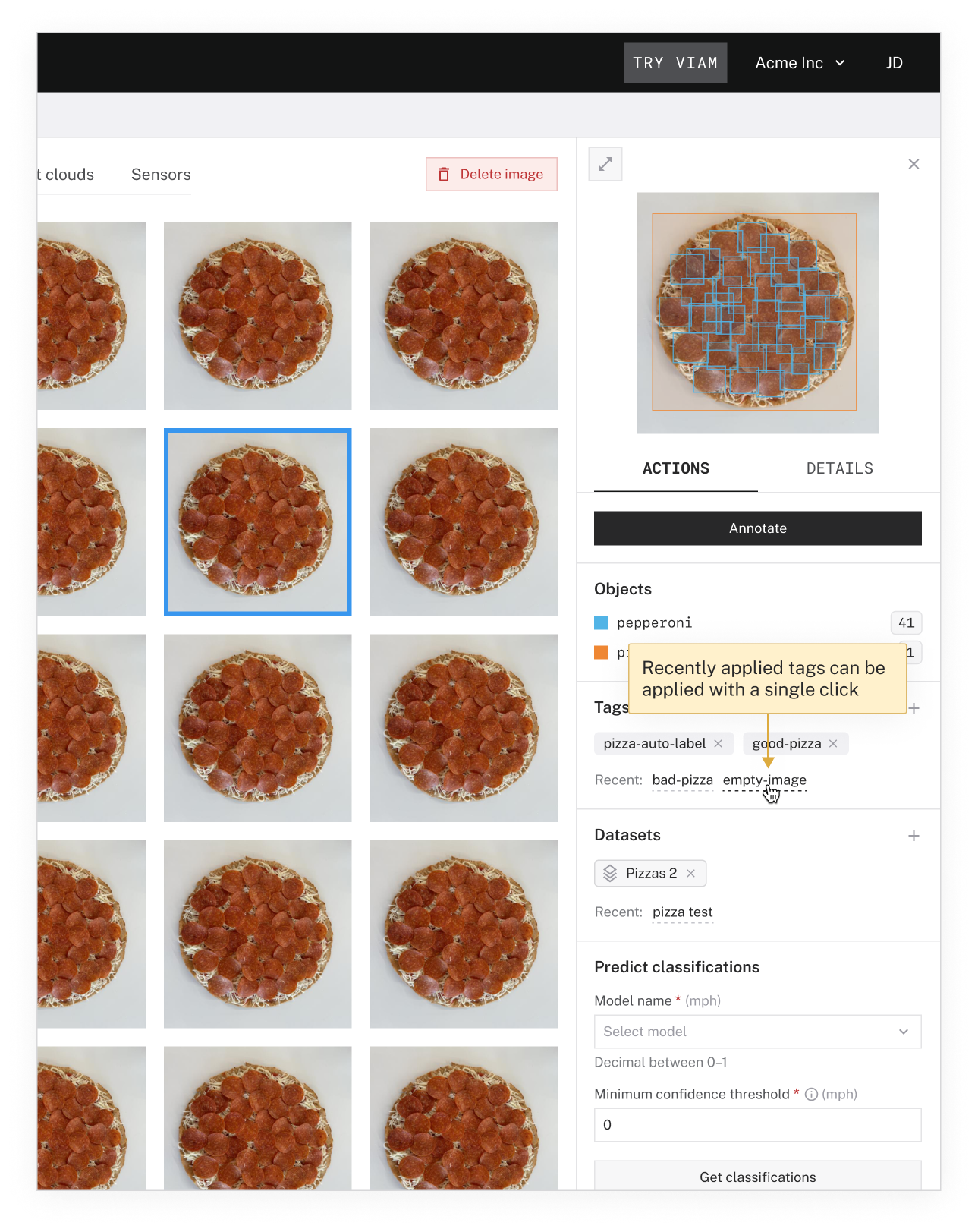
An optional add-on to Select and Multiselect inputs that aims to speed up common tasks by reducing the need to open the full input. The pattern surfaces options based on a user’s recent activity and lets users apply them with a single click.
This functionality is intended to be secondary to the Select/Multiselect inputs. Ensure that the options being shown are relevant. It is better to show nothing than to surface irrelevant options. Display a maximum of 3 items, with the most recent first.
Since users can apply options with a single click, they should also be able to revert the action with a single click. If a user applies an option, the option should disappear from the Recents. If they then remove the option from the Multiselect, it should reappear in Recents.
Use this pattern…
• For inputs that are likely to be high-traffic
• When users are likely to select the same items repeatedly (ex: adding many individual images to a dataset)
• When the user’s recent choices are likely to be relevant