Input
- A simple user input. We use this input to build all of the other input types. This is ideal for text, email, and password fields.
Placeholder
import { Input } from '@viamrobotics/prime-core';<Input cx="max-w-[200px]" placeholder="Placeholder"/>Labels
For accessibility, consider wrapping your <Input /> in a <Label />.
Use slot="input" to correctly render.
import { Input, Label } from '@viamrobotics/prime-core';<Label> Full name <Input slot="input" cx="max-w-[200px]" placeholder="Eliot Horowitz" /></Label>Error states
These inputs can have two error states. Both implement the Input component’s error state, which includes changing the input field’s border to the semantic/danger-dark color, accompanied by an error icon to the right.
Error message below input
The first error state displays a message directly below the input field, also styled in semantic/danger-dark color text.
<Label slot="component"> Full name <div slot="input" class="mb-2 max-w-[200px]" > <Input slot="input" state="error" /> <Label slot="component"> <span class="text-danger-dark">This field can't be left blank.</span> </Label> </div></Label>Error message in reactive tooltip
The second shows a reactive tooltip with error messaging.
<div slot="component" class="relative flex flex-col items-center"> <Input slot="input" state="error" class="mb-2 max-w-[200px]" value="/" /> <Tooltip client:load location="bottom" state="visible" > <p slot="description">Can only contain letters, numbers, dashes, and underscores</p> </Tooltip></div>💬 Error state guidelines
When to use each error state
The reactive tooltip variant should only be used in cases with vertical space constraints around the input.
In general, use error messaging below inputs when vertical space is available below the input. Otherwise, use tooltip. Tooltips should be used in situations with limited space and/or padding. In these situations, the input usually does not have a label. Error messages should be used if a value is missing.
Numeric Input
A user input for numeric values. This is ideal for number and integer fields. The value can be incremented/decremented using the up/down arrow keys.
import { NumericInput } from '@viamrobotics/prime-core';<NumericInput cx="max-w-[80px]" />Slider Input
A numeric input variant that visually represents the range of possible values and lets the user drag to make easy adjustments. Use for inputs where the user is likely to want to experiment with values between a defined min and max.
• Ex: Adjusting a confidence threshold between 0 and 100%
• Ex: Adjusting the power percentage of a motor between 0 and 100%
import { SliderInput } from '@viamrobotics/prime-core';<RangeInput cx="max-w-[300px]" />Draggable numeric input

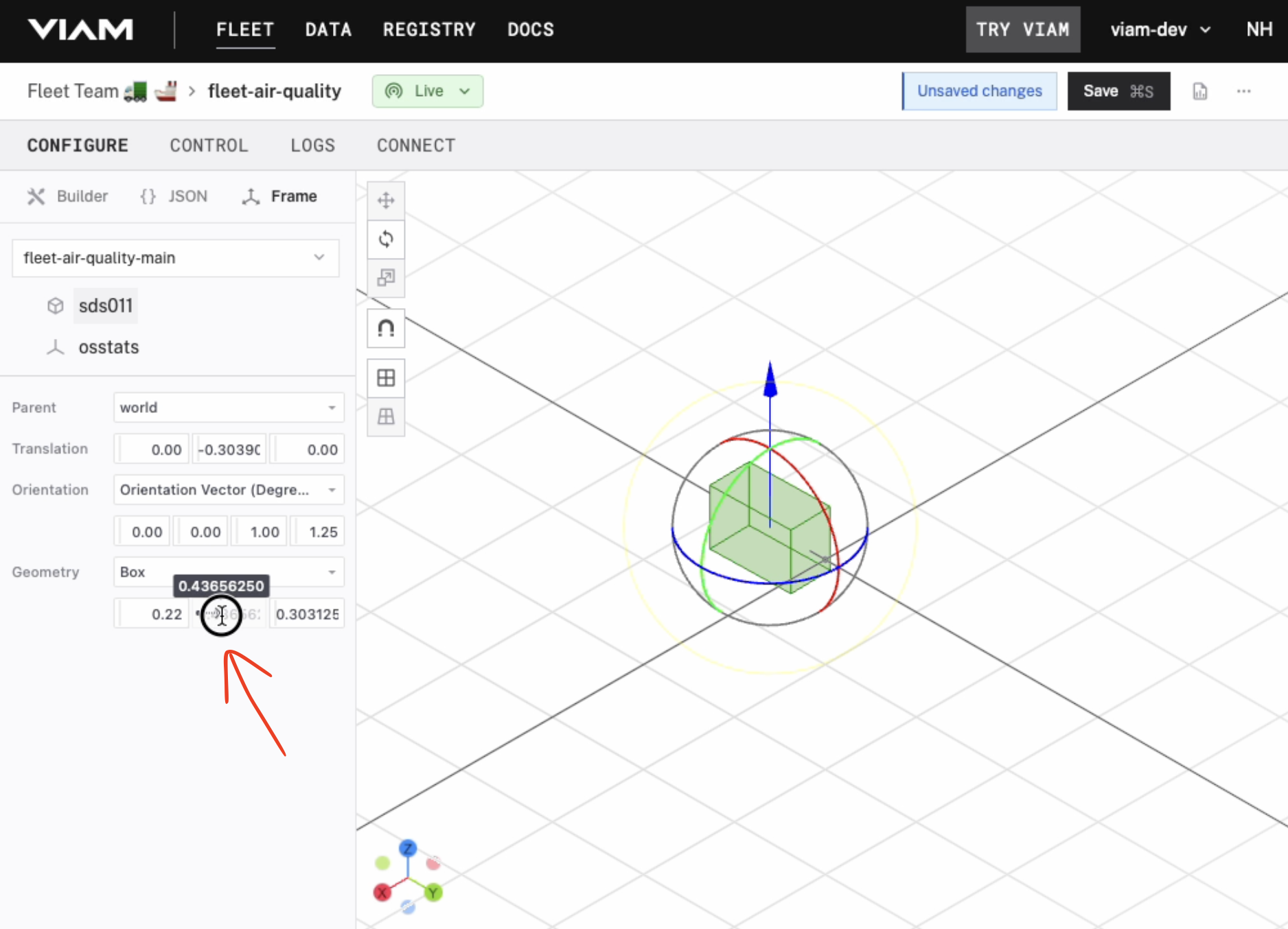
In special cases, we use a numeric input variant with a draggable handle on the left side of the input. This input should only be used in direct manipulation interfaces, which require object visibility and immediate feedback. We use these sliders in the Frame configuration view.
This component is not in PRIME. We use Tweakpane’s number binding component stylized to blend into Viam’s design language.
💬 Helper text

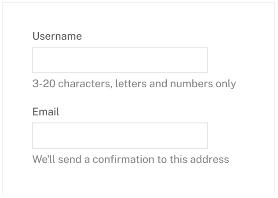
Helper text below an input field surfaces supplementary information about an input to aid users in filling out fields correctly. It can also be used to clarify how the information will be used.
Use helper text sparingly and intentionally. Excessive helper text can clutter the interface and overwhelm users, especially in complex forms with many fields. Use only when users likely need extra guidance to complete a field correctly.
If the input label already provides sufficient context for filling an input, do not include helper text. If the information is less critical and the user does not need to directly reference it while filling in the input, consider using an info icon by the label with a tooltip to maintain a clean interface while still providing necessary context.
Use helper text…
• To provide clarifying information required to know how to correctly fill out the input
• To show helpful hints about required format (ex: “Format: MM-DD-YYYY”) or examples of the correct format
Don’t use helper text…
• If the input label already provides sufficient context for completing the action